Selection of a map by Allice Hunter – United Nations Development Programme: Human Development Report 2021-22: Uncertain Times, Unsettled Lives: Shaping our Future in a Transforming World. Human Development Reports 272–275. United Nations Development Programme (8 September 2022). Archived from the original on 8 September 2022. (Miller cylindrical projection), CC BY-SA 4.0, https://commons.wikimedia.org/w/index.php?curid=122787272
To this point in our course, we have focused on investigative or exploratory mapping – using geospatial data and GIS to visualize and scan various social or environmental phenomena. For our next activity, we will join tables of statistical data to geographic boundary files. This technique of combining two tables on a shared column is something GIS practitioners use very often. For example, a boundary layer containing all fifty U.S. states typically contains a column storing the name of all states (i.e., Alabama, Alaska, …). Another file may contain statistical data for all fifty states, including the name of each state, but no coordinate geography. These two tables can join the two “state name” columns, thereby bringing statistical data into a GIS.
Joining Tabular Data to Boundary Files
For our next activity, we will obtain data from the U.S. Census Bureau’s American Community Survey and integrate it into a U.S. state boundary layer by using the join feature of QGIS. As we learned previously when we examined Air Quality data provided by the U.S. E.P.A., there are standard codes for states and counties called FIPS codes. FIPS in an acronym for Federal Information Processing Standards, and they correspond to all U.S. states, counties, places, and congressional districts. For example Pennsylvania, we learned, is “42” Lehigh County, Pennsylvania is “42077”. There are additional codes we can utilize to match statistical data to geospatial boundary files, but they are more domain specific.
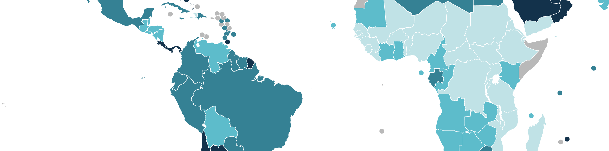
We will do this same ‘join’ activity with United Nations’ Human Development Index data, which will will incorporate into a QGIS thematic data layer by joining on the ISO 3166-1 codes. The International Organization for Standards (ISO) is responsible for maintaining an authority list of 3-letter codes for countries. We will use a boundary layer obtained from ArcGIS Hub to which we will join tabular Human Development Index data obtained from this website: https://hdr.undp.org/data-center/human-development-index#/indicies/HDI.
Choropleth Maps
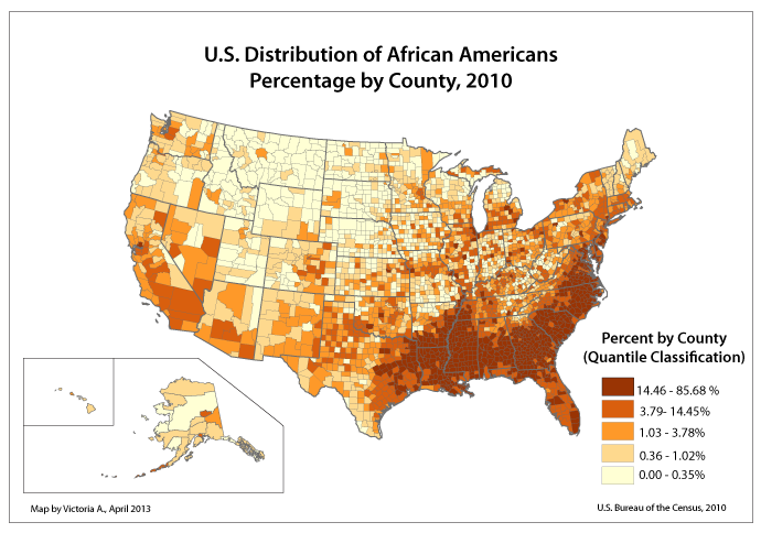
We were introduced to choropleth maps on the first night of class when we considered those created by W.E.B. DuBois and his assistants for their installation, The American Negro, for the Paris Exhibition of 1900. Several choropleth maps were produced for inclusion in the Paris Exhibition. Once we have successfully combined our U.S. Census Bureau ACS and United Nations HDI data to our maps, we will return to our categorization techniques to create two or more choropleth maps. These types of thematic maps are very common. So far, we have used the categorization and classification techniques available in QGIS to differentiate various point layers. Next, we will apply the same techniques to polygon layers (political boundaries) which now, thanks to tabular joins, contain demographic data.
The QGIS Print Layout Manager
Once we have generated two or more maps, we will examine the QGIS Print Layout Manager features to distill a file suitable for use in slide presentations, handouts, or posters. We will incorporate a legend, a scale bar, labels, a map title, and perhaps other text boxes providing context for the thematic choropleth maps we make.
[Bonus] The United Nations Gender Equality Indices
The U.N.’s Human Development Index strives to shift the focus from global economic development, which primarily measures economic productivity, to human development, which intends to track the growth and improvement of the human condition. The HDI examines longevity, education access and attainment, and personal income at the level of the individual and family.
Similarly, the U.N.’s Women’s Empowerment Index (WEI) and the related Global Gender Parity Index (GGPI) are ways of documenting and tracking improvements, and setbacks, as they relate to a country’s efforts to improve gender equality. In a similar way to the HDI, the WEI and GGPI aim to present for each country how women’s health, longevity, economic access, and education attainment relates to that country’s men. Human progress, overall, cannot be adequately measured without considering how women and girls fare across the world.
Data from these two initiatives under the United Nations Development Program are available at this URL: https://www.unwomen.org/sites/default/files/2023-07/the-paths-to-equal-annex-tables-en.xlsx. Some copying and pasting is required, but these data can be presented as choropleth maps using the same strategies and techniques employed in the activities above.