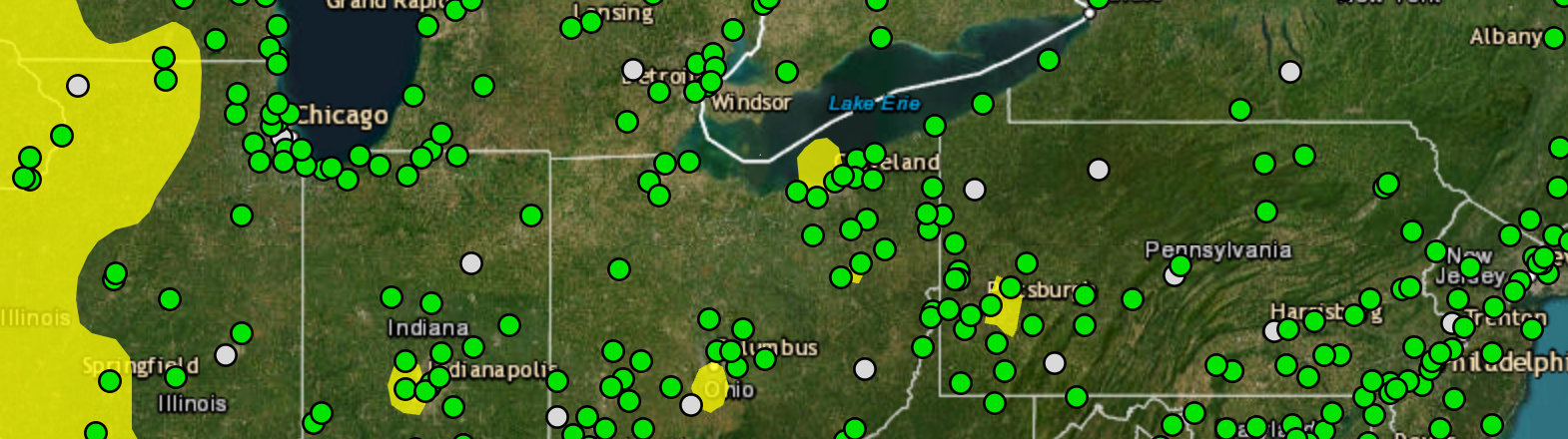
Screen capture of the U.S. E.P.A. AirNow.gov map featuring AQI and PM 2.5 monitor readings for 20 September 2023 over the Mid-Atlantic and Great Lakes regions of the United States.
Air Quality Mapping – Part Two
In today’s class, we will finish our animated time-bound map using the temporal controller feature of QGIS. The instructions for this activity are here:
https://docs.google.com/document/d/1VJ-WawidEl65lNIsyhDFXaBO08ND8n1zWg2QdE-fpo8/edit?usp=sharing
We have imported, mapped, and animated PM2.5 readings from monitors within the U.S. E.P.A.’s AirNow.gov inventory. We have also utilized county boundary files maintained and provided by the U.S. Census Bureau – a steward of much of the best socioeconomic and demographic data available, as well as geographic boundaries like counties (and equivalent units), ZIP Code tabulation areas, census tracts, block groups, and blocks. We will look more at the geospatial products of the U.S. Census Bureau in a future class.
While we have concentrated primarily on mapping a recent salient topic – the Canadian wildfire smoke from the summer of 2023 – the issue of poor outdoor air quality and its impacts is much more broad. The various air quality measures tracked by the government and others were literally ‘off the charts’ this summer as waves of smoke passed through our most populous places. Everyone who ventured outdoors for too long felt tightness in their chest, stinging eyes, and sore throats. Even the most healthy of us felt the direct impacts of fine particles and contaminants on their respiration, and prolonged outdoor activity was strongly discouraged for everyone.
But those of us already suffering from the effects of prolonged exposure to poor air quality may feel these kinds of impacts over much of the year. Collecting data on air quality, and knowing how to evaluate these data, serves several important purposes. First, these data can help us to prioritize mitigation of sites that impact vulnerable populations. We may and should make planning and zoning decisions for industries contributing to air pollution based upon the locations of child care centers, schools, hospitals, retirement communities, athletic facilities, and residences. These data, as we see with AirNow.gov’s dashboard, allow us to both monitor and model the complicated relationships between our weather system, climate, and pollution. This helps us know better how to protect the vulnerable and provide warnings to those most impacted. These data, as we see with AirNow.gov’s dashboard, allow us to both monitor and model the complicated relationships between our weather system, climate, and pollution. This helps us know better how to protect the vulnerable and provide warnings to those most impacted.
Monitoring allows us to identify stationary contributors to localized poor air quality and determine if those entities are within compliance of various regulations. We can also use these data to refine these regulations, insisting that new and better technologies that already exist be applied to activities that contribute to poor air quality. These data also help us make a more compelling case for the development of new technologies to clean our industries and clean up our air.
Similarly, data like these help us make the case for burning fewer fossil fuels, which contribute to the amount of harmful chemicals and particulates in the air, as well as carbon dioxide and methane, two greenhouse gases contributing to the rise of global temperatures.
Finally, as we’ve already discussed, monitoring allows us to consider various social, economic, and demographic characteristics of places, thus helping ensure that both positive and (necessary) negative land uses are shared equitably across our population. In cases where these burdens have not been equal, equitable, or fair we can work to make things right and just.
Next Steps
If you enjoyed this activity, try to expand on this work. Repeat the process to map the daily Air Quality Index (AQI), or map other metrics like PM 10 or ozone. It is possible to construct seasonal comparatives that account for non-human contributors to poor air quality like pollen. With a vast and growing archive of data, it is possible to do year-over-year comparatives to see if a city or a region is improving over time, or if the conditions are getting steadily worse. If you would like to learn more, consider purchasing and managing your own PurpleAir air quality monitor, and explore the data being collected and provided through this commercial service. Most importantly, talk to others about this critical issue. Hopefully after these activities you feel better informed. We have only touched lightly on these topics, but with what we have learned, please feel empowered to search and read and study more.
[BONUS] A Case Study – Dr. Bullard, Whispering Pines Landfill, & the Environmental Justice Movement
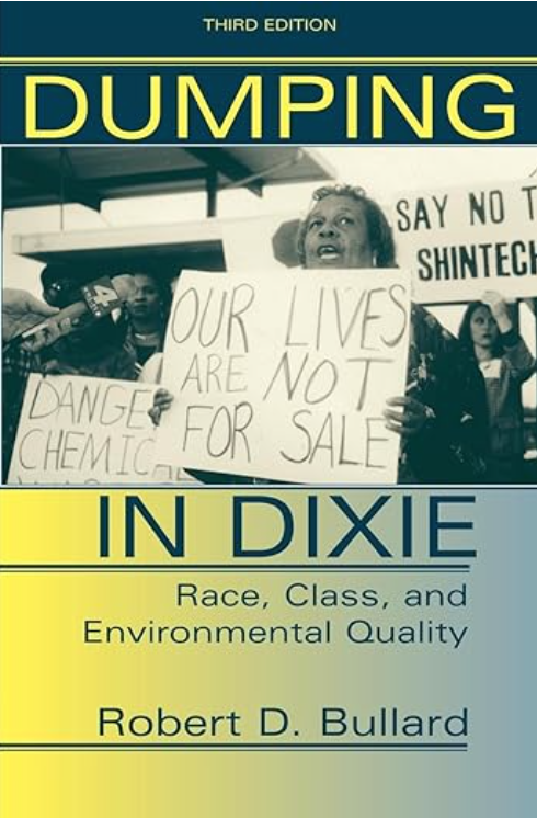
We spoke a bit during class about Dr. Bullard’s book, Dumping in Dixie: race, class, and environmental quality (Westview Press, 1990). But the Whispering Pines landfill and the situation in Houston are far from unique. In 2018, USA Today, Robin Amer, Anjeanette Damon, and Kameel Stanley produced an excellent podcast called, The City which, over several episodes, investigates an illegal dump in a Black neighborhood of Chicago. One episode details Dr. Bullard’s efforts in Texas and throughout the South to document the racist disparities and unequal impacts of harmful land uses. You can listen to Episode 8 about Dr. Bullard and others in Houston whose work serves as an early example of how citizens can organize themselves and demand environmental equity. The whole series is excellent, and you can find it here: https://wondery.com/shows/the-city/season/1/.
Photograph: Cover of Dumping in Dixie by Dr. Robert D. Bullard