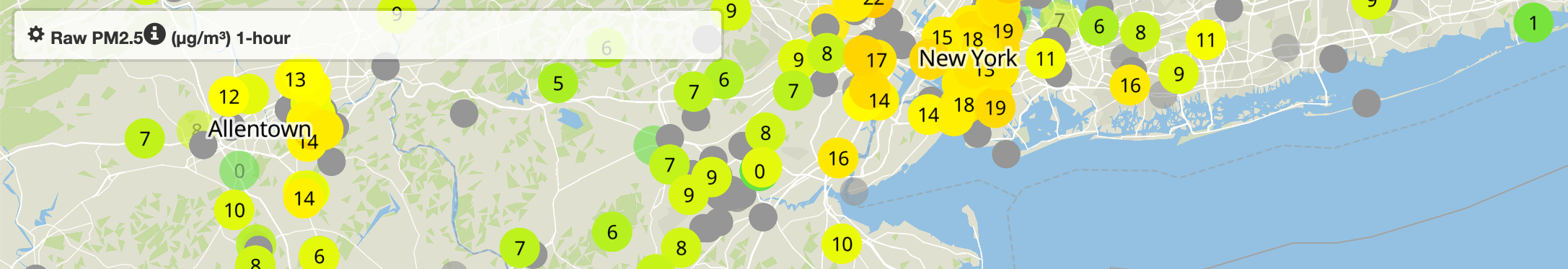
Screen capture of the PurpleAir Real-time Air Quality Map depicting Allentown, PA and New York, New York on 18 September 2023.
Air Quality, Temporal Mapping, and Environmental Justice
Drought and unusually high spring temperatures across western Canada made seasonal wildfires larger, hotter, and more numerous this year. Smoke from these fires blanketed North America, and settled over Canadian and U.S. cities for days at a time. Bands of smoke cleared and arrived again in successive waves over much of the central and north eastern U.S. throughout June and July, 2023.
These wildfires, intensified by a warming arctic and certainly inflected by the human burning of fossil fuels, are likely to become more frequent, raising alarms for millions who may experience the short- and long-term health impacts of fine particulates and contaminants carried on the haze. Unhealthy for all, the worst impacts were felt by some populations much more than others. Those already suffering from the health effects of poor indoor and outdoor air quality, those with asthma and other respiratory ailments and diseases, the very young, the elderly, pregnant people, and those with compromised immune systems are the most impacted and vulnerable populations. Many people are already sensitized to Air Quality Index scores and likely already monitor weather reports for daily air quality forecasts. Our question: how can we access, visualize, and analyze air quality data of various kinds with GIS?
For more background on these events and their effects, see:
- Canada wildfires: what are the causes and when will it end?
- Air Quality Health Advisory Issued for All Regions of New York State In Effect for June 29, 2023
- Bad air quality poses a particular risk to children with asthma. In unequal Philly, those kids are mostly Black and Hispanic.
- Even After Smoke Clears, Let’s Keep Talking About Air Quality
Our Activity
Over the next two classes, we will survey sources of available air quality monitoring data. We will discuss some of the challenges we will face gathering, processing, and analyzing various sources of air quality and other environmental data. We will take a look at both governmental and non-governmental air quality data providers, particularly the U.S. Environmental Protection Agency’s AirNow.gov and PurpleAir, Inc.’s Real-Time Air Quality Map and we will discuss relative advantages and disadvantages of these web-based air quality monitoring ‘dashboards’. We will explore some challenges academic and citizen researchers face when trying to obtain various kinds of environmental quality data.
We will also introduce some of the services provided by the U.S. Census Bureau, and consider why some geographic units put forth by the Census Bureau become the de facto administrative and statistical entities upon which much geospatial analysis relies. We will utilize some of the boundary features provided via TIGER/Line geodatabases, and gain some familiarity with FIPS codes — Federal Information Processing System (FIPS) Codes for States and Counties — and how these can often serve as match points for joining tabular statistical data to geospatial data suitable for display and analysis in a GIS.
Lastly, we will get some practice using good, old-fashioned spreadsheets to prepare data for ingestion into QGIS. In particular, we will look at concatenation, trim, and join functions and review how important it is to assign the correct data type to fields.
The directions for this activity can be found here:
https://docs.google.com/document/d/1VJ-WawidEl65lNIsyhDFXaBO08ND8n1zWg2QdE-fpo8/edit?usp=drive_link
QGIS, Temporal Settings, and Dynamic Temporal Control
Finding a way to present time-bound data on static maps is a challenge as old as mapping, itself. When we open Google Maps on the web, or incorporate OpenStreetMap base layers into our QGIS projects we may want to imagine everything we see is a current and accurate reflection of the ‘real world’. But this simply is not true. It is especially not true when we utilize aerial or satellite-derived imagery of the earth. What we see when we view Google Maps satellite base layers or federal and state-provided aerial imagery is almost certainly an amalgamation of various sets of images collected at different times of the year (i.e., when the leaves are off the trees) or across several years.
For our main activity, we will acquire 2023 AirNow.gov data for Pennsylvania, New Jersey, and New York. We will examine the Daily Mean PM2.5 Concentration recordings for all available air quality monitoring stations across these three states. Next, we will determine an appropriate way to categorize these data for clarity, using the best symbology we can. We will also explore the temporal settings available in QGIS and animate the daily PM2.5 mean scores for 2023. This will show just how significantly dangerous our air quality has been throughout this year, especially as a result of the arrival and longevity of wildfire smoke and related contaminants.
Coming Up
For our next class, we will continue to discuss air quality monitoring and GIS, and we will finalize our temporal mapping activity. We will consider what Environmental Justice and Environmental Equity mean for our society, and we will take a look at the work and career of Dr. Robert D. Bullard, especially the legacy of his work in Houston, TX and throughout the southern United States, culminating in the publication of Dumping in Dixie: race, class, and environmental quality, and the genesis of the modern Environmental Justice movement in the U.S.